pacman::p_load(ggstatsplot, tidyverse)Hands-on_Ex04_b
ggplot2
ggiraph
plotly
DT
patchwork
Visual Statistical Analysis
Learning Outcome
ggstatsplot package to create visual graphics with rich statistical information
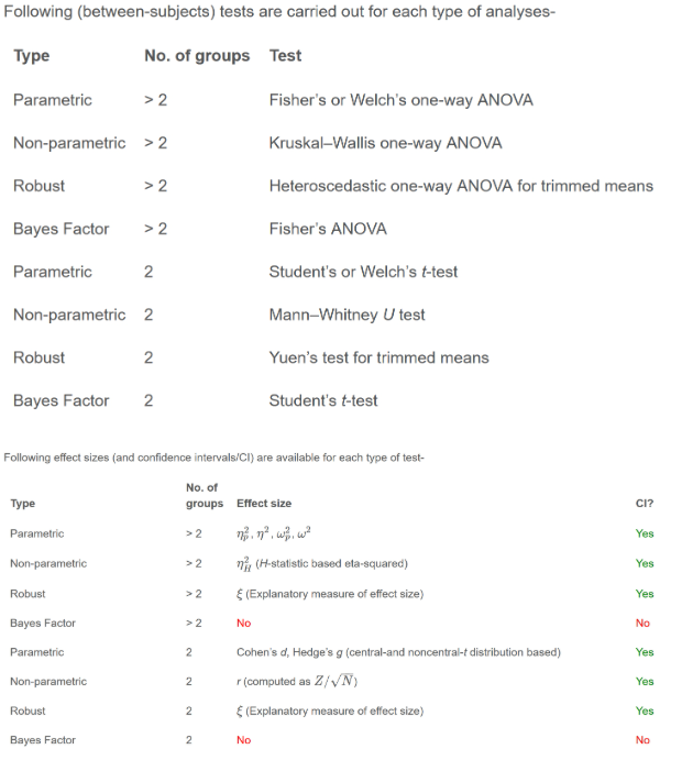
performance package to visualise model diagnostics
parameters package to visualise model parameters
Getting Started
Installing and launching R packages
In this exercise, ggstatsplot and tidyverse will be used.
Importing data
exam <- read_csv("Exam_data.csv")One-sample test: gghistostats() method
In the code chunk below, gghistostats() is used to to build an visual of one-sample test on English scores.
set.seed(1234)

gghistostats(
  data = exam,
  x = ENGLISH,
  type = "bayes",
  test.value = 60,
  xlab = "English scores"
)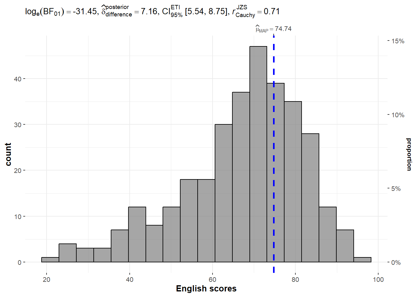
Unpacking the Bayes Factor
A Bayes factor is the ratio of the likelihood of one particular hypothesis to the likelihood of another. It can be interpreted as a measure of the strength of evidence in favor of one theory among two competing theories.
That’s because the Bayes factor gives us a way to evaluate the data in favor of a null hypothesis, and to use external information to do so. It tells us what the weight of the evidence is in favor of a given hypothesis.
When we are comparing two hypotheses, H1 (the alternate hypothesis) and H0 (the null hypothesis), the Bayes Factor is often written as B10. Null Hypothesis (H0): The true mean of the science scores is equal to the test value of 60. Alternative Hypothesis (H1): The true mean of the science scores is not equal to 60.
k log(n)- 2log(L(θ̂)): L(θ̂) represents the likelihood of the model tested, given your data, when evaluated at maximum likelihood values of θ.
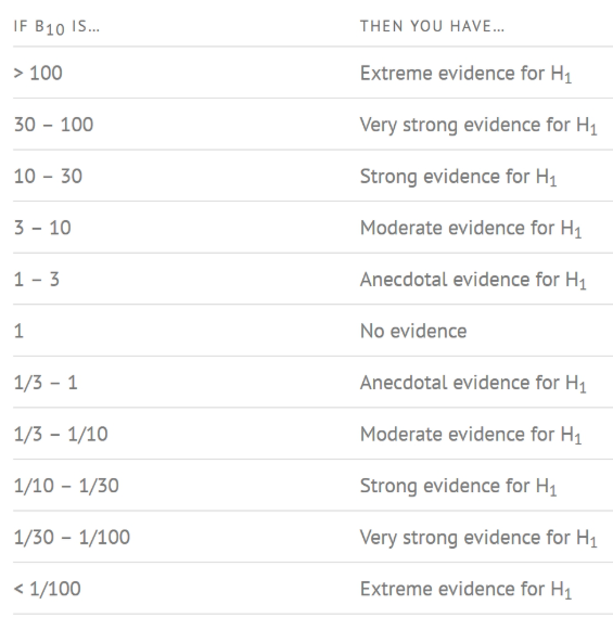
How to interpret Bayes Factor
A Bayes Factor can be any positive number. One of the most common interpretations is this one—first proposed by Harold Jeffereys (1961) and slightly modified by Lee and Wagenmakers in 2013:
Statistical Annotations:
- log_e(BF_01) = 2.12: This is the natural logarithm of the Bayes Factor (BF) comparing the null hypothesis (science scores = 60) to the alternative hypothesis. A Bayes Factor greater than 1 indicates evidence against the null, and the value here suggests that the data provide evidence against the null hypothesis H0 (since log_e(2.12) > 0).
- Δ_posterior mean = 1.12: This indicates the difference between the sample mean and the test value (60), suggesting the average score is higher than the test value.
- 95% CI: This confidence interval shows the range of values within which the true mean score lies with 95% probability, according to the posterior distribution.
- JZS = 0.71: This likely refers to the magnitude of the difference between groups or conditions.
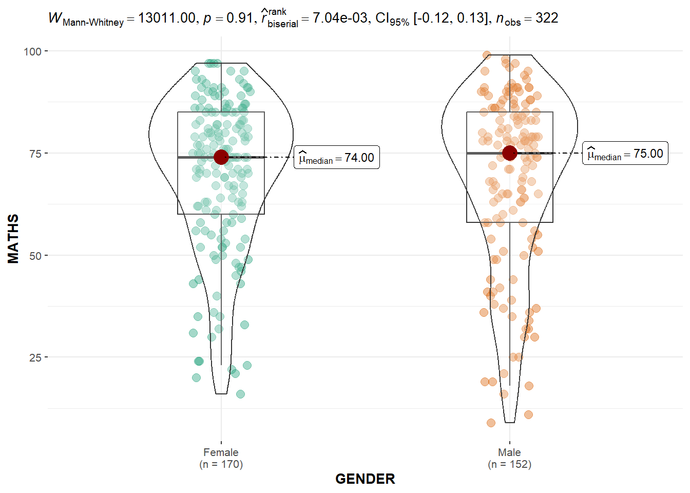
Two-sample mean test: ggbetweenstats()
In the code chunk below, ggbetweenstats() is used to build a visual for two-sample mean test of Maths scores by gender.
ggbetweenstats(
  data = exam,
  x = GENDER,
  y = MATHS,
  type = "np",
  messages = FALSE
)
Oneway ANOVA Test: ggbetweenstats() method
In the code chunk below, ggbetweenstats is used to build a visual for One-way ANOVA test on English score by race.
ggbetweenstats(
  data = exam,
  x = RACE,
  y = ENGLISH,
  type = "p",
  mean.ci = TRUE,
  pairwise.comparisons = TRUE,
  pairwise.display = "s",
  p.adjust.method = "fdr",
  messages = FALSE
)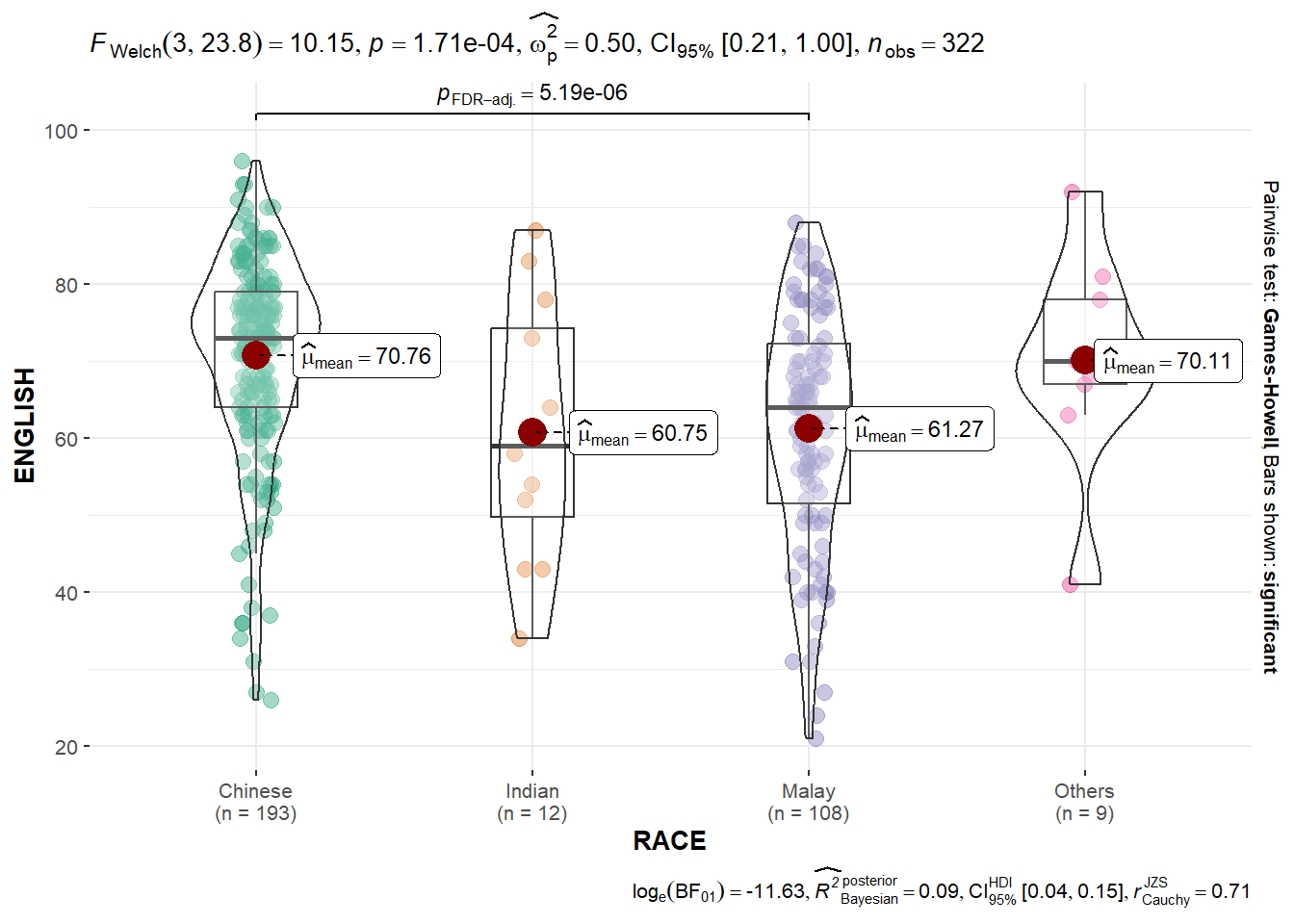
- “ns” → only non-significant
- “s” → only significant
- “all” → everything
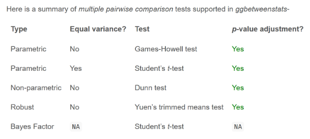
ggbetweenstats - Summary of tests
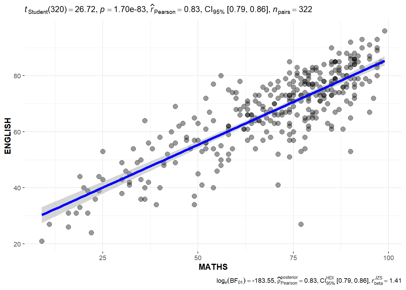
 ## Significant Test of Correlation: ggscatterstats()
In the code chunk below, ggscatterstats() is used to build a visual for Significant Test of Correlation between Maths scores and English scores.
ggscatterstats(
  data = exam,
  x = MATHS,
  y = ENGLISH,
  marginal = FALSE,
  )
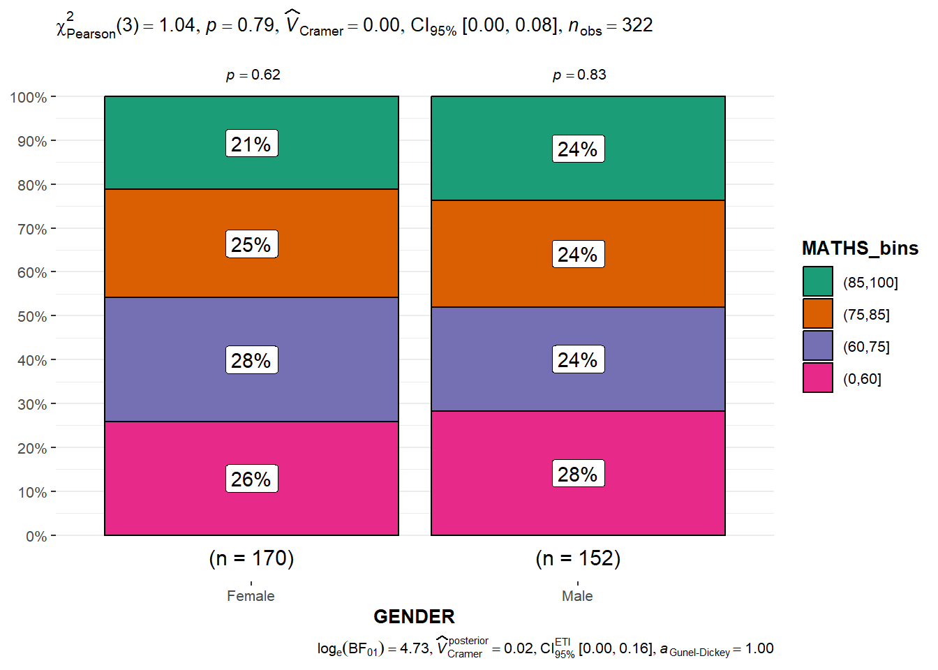
Significant Test of Association (Depedence) : ggbarstats() methods
In the code chunk below, the Maths scores is binned into a 4-class variable by using cut().
exam1 <- exam %>%
  mutate(MATHS_bins =
           cut(MATHS,
               breaks = c(0,60,75,85,100))
)
In this code chunk below ggbarstats is used to build a visual for Significant Test of Association
ggbarstats(exam1,
           x = MATHS_bins,
           y = GENDER)